[toe-tapping review] Animal Albums from A to Z by Cece Bell

#64 in an ongoing series of posts celebrating the alphabet.

As a teen I used to love browsing the wooden bins at our local record store. Which LP should I take home for $3.25? Decisions, decisions. It was always a conundrum when parting with precious allowance money.

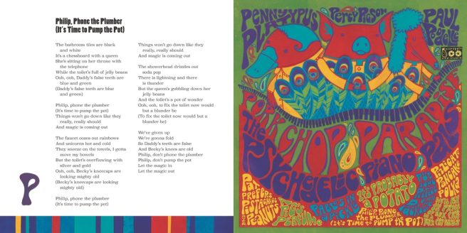
Of course I had been trained early on by my music-loving dad to treasure the vinyl discs that lived in all kinds of interesting cardboard sleeves (hello, Mantovani, Les Paul, Mario Lanza). As I began building my own record collection, I also grew quite enamored of album cover art — its own genre of inventive graphic design showcasing photos, illustrations, and typography — all on a neat 12″ x 12″ square.

Now that I think about it, some of my fave recording artists have animal names: Beatles, Monkees, Byrds, Steppenwolf, Buffalo Springfield, Iron Butterfly (and later, Eagles). So you can imagine how ecstatic I was to see Cece Bell’s, Animal Albums from A to Z (Walker Books, 2024) — a unique, wildly imaginative, uber creative tour-de-force that easily ranks in my top three favorite alphabet books of all time.

Letters. music. art. song lyrics. quirky. handmade. heartmade. humor. nostalgia. food (soup and pie!). Cece knows me. She’s checked all the boxes. Mind totally blown.

She opens her 64-page, all-ages ABC extravaganza with a tongue-in-cheek Introduction extolling the varied talents of imaginary animal musicians, enthusiastic to share 26 albums from her personal collection. She notes that they date from the 40’s to the 80’s, “the heyday of recorded animal music,” such records being difficult to find today.

Continue reading

(the buzz about) A is for Bee by Ellen Heck

#62 in an ongoing series of posts celebrating the alphabet.

Just when you think you know the alphabet, along comes a fun and inventive animal abecedarian that shows you what you’ve been missing. 

Set aside the predictable ‘A is for Alligator’ and ‘Z is for Zebra’ books. In Ellen Heck’s A is for Bee: An Alphabet Book in Translation (Levine Querido, 2022), we learn what 26 familiar animals are called around the world.

We speak to each other in many languages, and in some of them . . . A is for Bee.

Although the word bee begins with ‘B’ in English, in some other languages, it actually begins with ‘A’: Aamoo (Ojibwe), Abelha (Portuguese).

Continue reading

Indie Artist Spotlight: Sarah Walsh of Petit Reve

Today I’m pleased to welcome Kansas City-based artist, illustrator, and hand letterer Sarah Walsh to Alphabet Soup!

Pictured above is a collage she created this past summer called “Aqua Daydreams.” I loved it the moment I saw it — mermaids, jellyfish, the different shapes, lines, colors, and overall composition of the piece with its touches of whimsy and playfulness. It feels childlike and sophisticated at the same time, definitely invites a closer look, and much like the rest of her work, elicits unabashed joy and happiness.

“Horsie Love”

A graphic design major, Sarah worked at Hallmark for 12 years, has also illustrated for other card lines, helped Crayola create a character-based tween girl brand (Pop Art Pixies), and has designed typefaces and surface patterns (client list includes Usborne, Peaceable Kingdom, Land of Nod, Perseus, Red Rooster Fabrics). She and her artist husband Colin (love that name!) share a basement studio in their home and sell prints and other goodies via their Etsy shop Petit Reve.

Artists and illustrators Colin and Sarah Walsh of Petit Reve

Most recently, Sarah published three awesome coloring books for Rockport’s Just Add Color Series: Day of the Dead, Carnival, and Circus. (Have you read the recent HuffPo article about how coloring books help adults combat stress? I think we should all order Sarah’s coloring books ASAP! ):)

I know you’ll enjoy learning more about Sarah and feasting your eyes on her charmingly quirky, fun and vibrant creations. She counts among her major influences 50’s and 60’s illustration, family, friends and love in general. It’s so easy to see the ♥ in her work. 🙂

*   *   *

Continue reading

just my type x 2

#46 in an ongoing series of posts celebrating the alphabet

Hey there, Font Freaks! Why the long typeface?

I’ve got just the thing to titillate your Times New Roman. That’s right — a double platter of tippy top typography today! (Say that fast five times.)

Those of us in love with the alphabet usually love to play with our fonts — after all, there’s one for every mood, every emotion, every occasion, every whim.

When I first set up this blog two years ago, I changed the standard fonts that came with my template. You’re now looking at Fertigo Pro in the blog title, Adelle for headings,  Slab for general text. They all seemed friendlier somehow.

Lately, I’ve been quite partial to Lucida Bright or Bookman Old Style when drafting new stories in Word. I’m surprised how anti-creative some fonts can be (sorry, Impact). And I still don’t get all the flack about Comic Sans or Courier. Neither has ever stolen my chocolate. 🙂

On to today’s offerings.

* * *

First Bite

Behold the delightful work of art student Pranita Kocharekar of Mumbai, India. She’s studying typography and recently designed this wonderful illustrative typeface called, “Bird Watching,” which earned her a 2013 Typographer of the Year Award. She used upper and lower case A-Z, 0-9, and some punctuation, and she’s thinking of selling bags and vests featuring the design. Yay!


Pranita also created this delightful story called Lost in Typeland, which features two characters who befriend each other, the famous typeface Bodoni and a little girl. Too cool. Be sure to click here to read the entire story and view Pranita’s portfolio.


* * *

Second Bite

Check out this clever paper-letter animated short, “The History of Typography,” created by Ontario-based graphic designer Ben Barrett-Forrest. It consists of 291 paper letters, 2,454 photographs, and required 140 hours of work! So amazing, Bravo!

* * *

There now, didn’t it feel good to get your Garamond on?

I love me a good font feast.

Ahhhhhh — to serif or not to serif, that is the question. 🙂

♥ More Alphabetica here.

P.S. Take the quiz: “What Font Are You?”

* * *

alphabet iconCertified authentic alphabetica. Handmade just for you with love and 26 of your best friends in natty upper and lower case.

—————————————————-

Copyright © 2013 Jama Rattigan of Jama’s Alphabet Soup. All rights reserved.

bow wow wowing at gemini studio art

Yes, I’ve gone to the dogs again.

golden cupcake

Recently sniffed out Stephen Fowler’s wonderful illustrations at Gemini Studio Art. His current collection  contains 1000+ designs inspired by the many dogs in his old Wrigleyville, Chicago, neighborhood, his former day job designing labels for whiskey and tequila bottles, and his fascination for big graphic artwork, vintage/urban design and advertising posters. Pretty fetching, I say.

More of my faves with food-related themes:

Continue reading