Yes, come in! Please do.
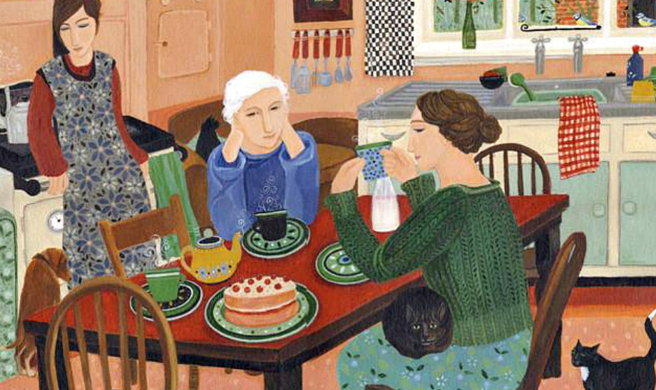
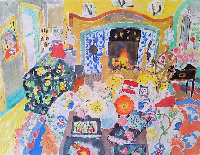
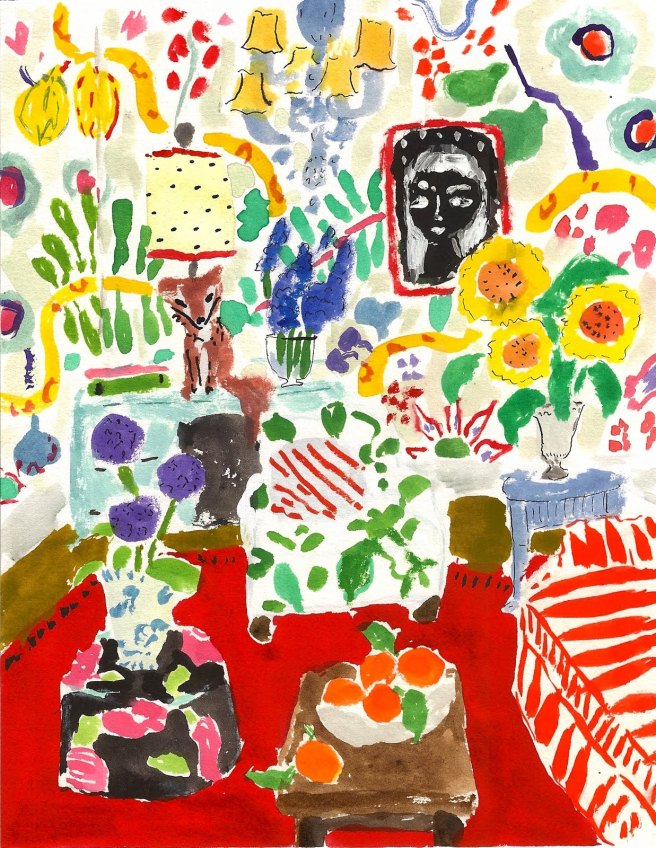
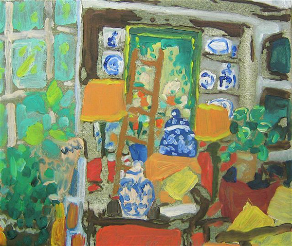
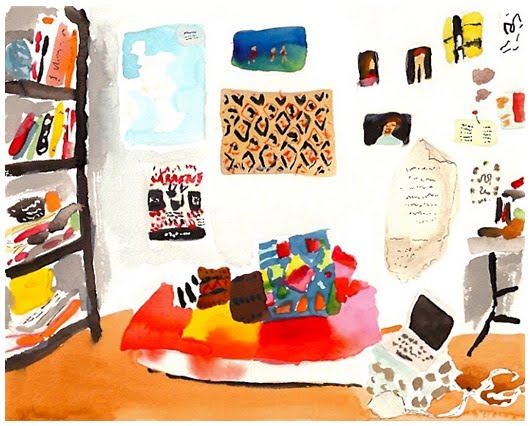
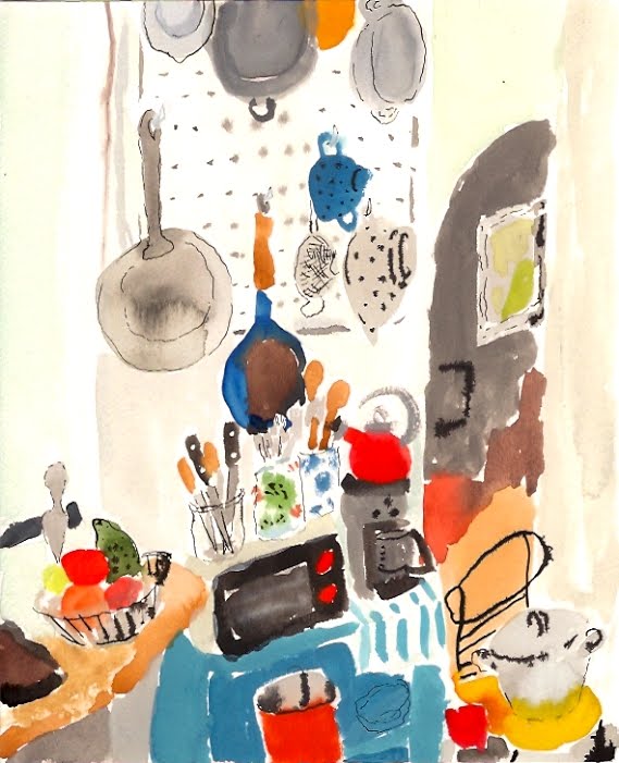
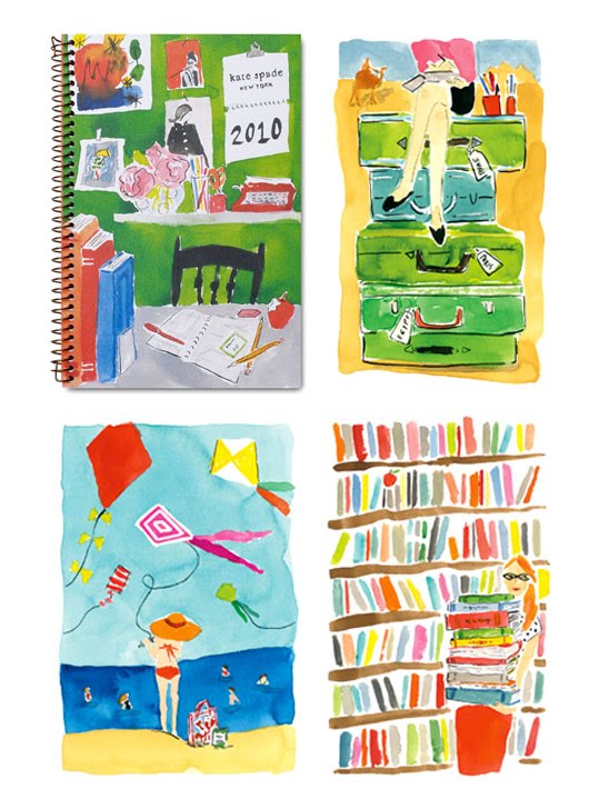
Bella Foster’s watercolor interiors are cheery, welcoming, colorful, quirky and exuberant. Who can resist stepping into a world of bright and pretty florals, cozy fireplaces, and inviting bookcases?

Currently living and working in Los Angeles, Bella studied painting at the School of Visual Arts in New York City. She counts among her inspirations Bonnard, Matisse, Josef Frank, and Mary Cassatt.

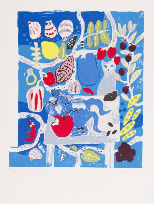
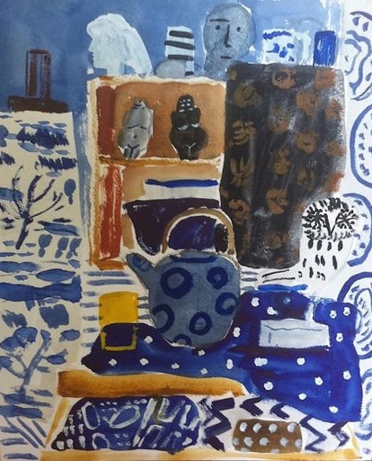
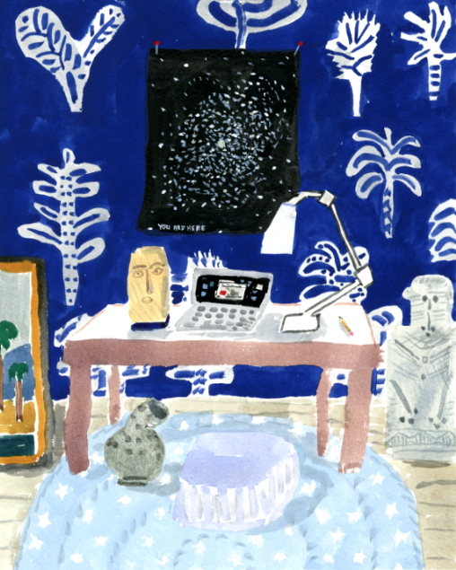
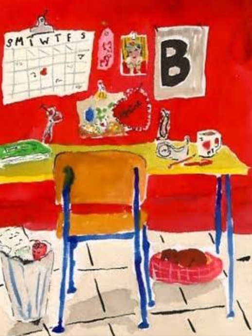
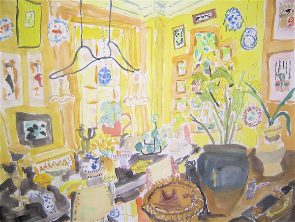
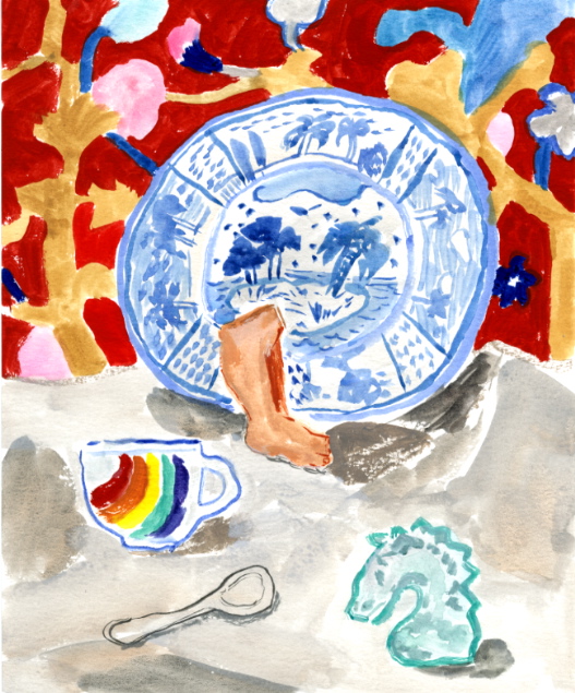
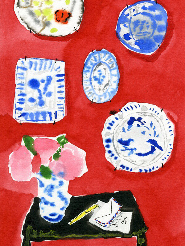
Her love of pattern and textiles is evident in her still life tableaux. Very few people inhabit her pictures; she instead likes to think of “people’s stuff” as characters in composition.
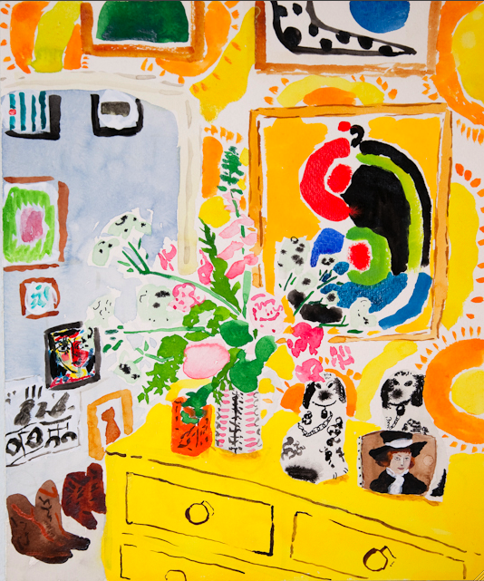

Bella started painting still lives and interiors about 15 years ago, at first making them up, and then using photos she took of friends’ apartments, as well as images from books, art history, and magazines as reference. She likes “finding the beauty in the way people live.” How someone inhabits and decorates a living space, with its furnishings and everyday paraphernalia, tells a fascinating story. And of course her imagination figures prominently in her work, adding a fanciful touch that makes the ordinary extraordinary.
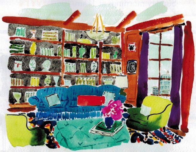

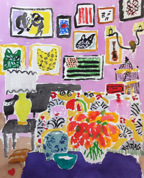
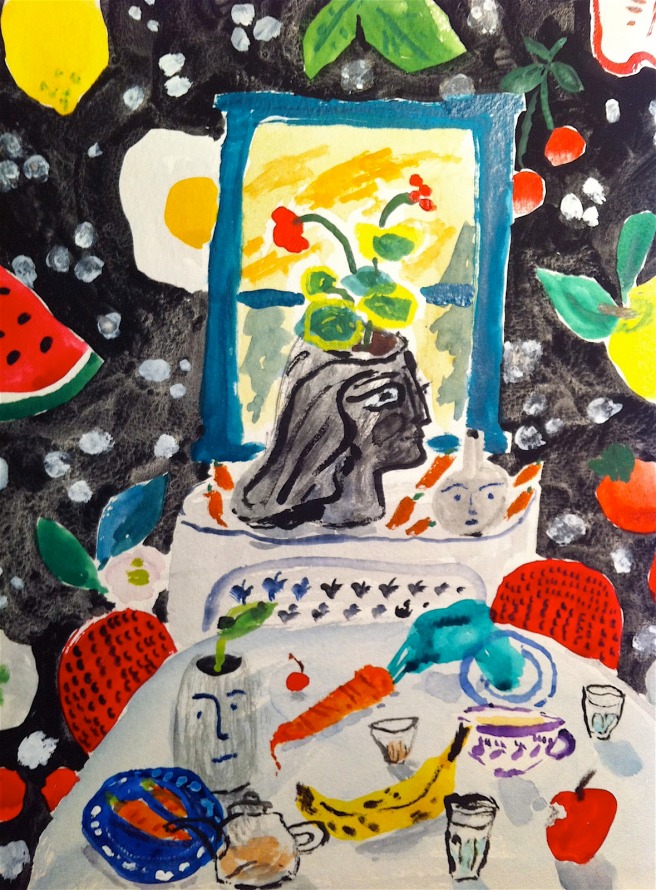
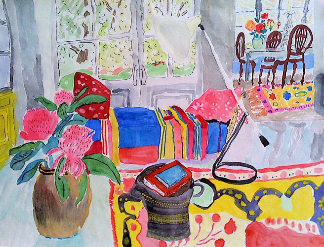
I do enjoy poring over Bella’s paintings, taking careful note of ceramics, rugs, upholstery, wall hangings, lampshades, and other random objects. It’s true that every room has a personality, and probably the most interesting rooms are the ones that are not in perfect order. Bella’s rooms feel alive.
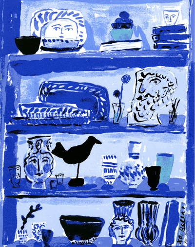


As a medium, watercolor’s fluidity is well suited to Bella’s freeform style. In some of her still lives, she blends in abstract elements that suggest rather than specifically define certain objects.
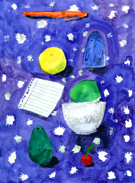

She has said that her favorite color is red, but her “go-to” color is blue. She considers peanut butter and chocolate the best invention, and her handmade guitar her most prized possession.


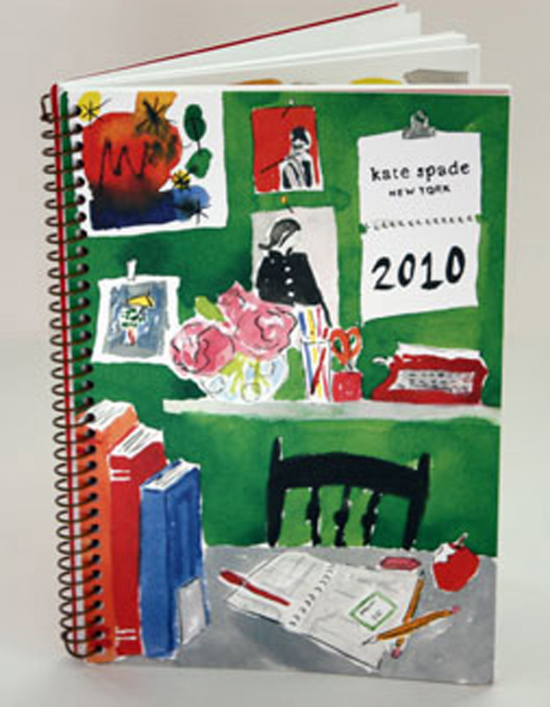
She also did the art for the 2010 Kate Spade calendar. Love how she captured the charm and playful sophistication of the brand.
Bella has exhibited in various galleries in California and New York. You can find out more at her official website, and purchase prints at several online sites, including Stampa.
Copyright © 2019 Jama Rattigan of Jama’s Alphabet Soup. All rights reserved.

Luscioius work! What a way to add joy to the world!
LikeLiked by 2 people
oops, Luscious! 🙂
LikeLiked by 1 person
Beautiful indeed–and inspiring! (I’m doing the storystorm challenge, and found an idea hiding in these wonderful paintings. Thank you!)
LikeLiked by 2 people
I see that you discovered some luscious ‘blues’ in these, too, Jama. How wonderful they are, and I do see a bit of Matisse in them. Love “finding the beauty in the way people live.” as Bella’s inspiration. Thank you for all. I found a few favorites!
LikeLiked by 1 person
Besides the influence of Matisse, I noticed she uses a lot of owls in her decor. I heartily approve of both.
LikeLiked by 1 person
I love Bella’s paintings, too. Thanks for sharing them. I love the happy colors and playful, intricate designs. I definitely see the Matisse influence.
LikeLiked by 2 people
What a joy for the senses. Such beautiful work.
LikeLiked by 2 people
Colors are wonderful. Very Matisse like. Lots of fun. Really enjoyed these.
LikeLiked by 2 people
Reblogged this on sketchuniverse and commented:
🎈HI LOVELIES, TODAY I WANT TO INTRODUCE YOU TO OUR SISTER, JAMA RATTIGAN. A VERY GOOD HEIRESS OF ART BY HENRI MATISSE AND DAVID HOCKNEY. BRAVO ❗
LikeLike