Indie Artist Spotlight: Sarah Walsh of Petit Reve

Today I’m pleased to welcome Kansas City-based artist, illustrator, and hand letterer Sarah Walsh to Alphabet Soup!

Pictured above is a collage she created this past summer called “Aqua Daydreams.” I loved it the moment I saw it — mermaids, jellyfish, the different shapes, lines, colors, and overall composition of the piece with its touches of whimsy and playfulness. It feels childlike and sophisticated at the same time, definitely invites a closer look, and much like the rest of her work, elicits unabashed joy and happiness.

“Horsie Love”

A graphic design major, Sarah worked at Hallmark for 12 years, has also illustrated for other card lines, helped Crayola create a character-based tween girl brand (Pop Art Pixies), and has designed typefaces and surface patterns (client list includes Usborne, Peaceable Kingdom, Land of Nod, Perseus, Red Rooster Fabrics). She and her artist husband Colin (love that name!) share a basement studio in their home and sell prints and other goodies via their Etsy shop Petit Reve.

Artists and illustrators Colin and Sarah Walsh of Petit Reve

Most recently, Sarah published three awesome coloring books for Rockport’s Just Add Color Series: Day of the Dead, Carnival, and Circus. (Have you read the recent HuffPo article about how coloring books help adults combat stress? I think we should all order Sarah’s coloring books ASAP! ):)

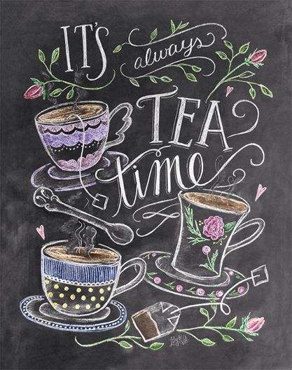
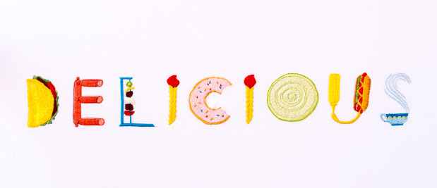
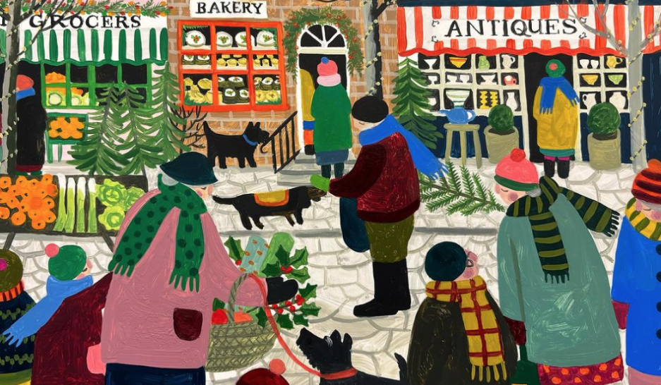
I know you’ll enjoy learning more about Sarah and feasting your eyes on her charmingly quirky, fun and vibrant creations. She counts among her major influences 50’s and 60’s illustration, family, friends and love in general. It’s so easy to see the ♥ in her work. 🙂

*   *   *

Continue reading

chalk it up to lily and val

#49 in an ongoing series of posts celebrating the alphabet

tea
All images © 2014 Lily and Val

There’s something wonderfully nostalgic and old school about chalk art. I remember being so excited when it was my turn to erase the blackboards in grade school. Before clapping the erasers outside, replacing stubs with brand new sticks of chalk, and wiping the boards clean with a wet rag, I liked to “play teacher” with my own little scribbles and drawings.

Now I have three chalkboards in my kitchen: one for the grocery list, one displaying an inspirational quote for the week, the third to advise guests: “Feel free to wait on me.” 🙂 There’s also another chalkboard in our dining room, where I post the menu when we have company for dinner (it’s fun to “play restaurant”).

teatime

No surprise that I fell hard for Valerie McKeehan’s charming hand lettered chalk art, which she features on prints, note cards, stationery, gifts and accessories. Naturally I love her kitchen-themed designs best — tear-off placemats, illustrated recipes, menu boards, foodie sayings. Lily & Val products are quaintly whimsical with that undeniable handmade-heartmade quality I covet, and are available via LilyandVal.com or at the Lily & Val Chalk Art Boutique on Etsy.

I recently ordered some note cards which arrived lickety split — I kind of hate to part with them, but will enjoy sending them to special friends. 🙂

Enjoy this little Lily and Val sampler. How can you resist?

Continue reading

a little taste of susan branch’s a fine romance + lemon butter cookies

“England, with its history and air of magic, the soil and woods thick with meanings that survive in fragments, is an empire of imagination.” ~ T.S. Eliot

IMG_2197
Help yourself to a cup of organic darjeeling and a lemon butter cookie.

Fancy a drive along a winding country road, rolling green hills and grey stone walls as far as the eye can see? Perhaps a leisurely stroll along an ancient footpath across a meadow resplendent with wildflowers?

Maybe you’d rather visit Beatrix Potter’s house, explore the formal gardens of a stately home, find a welcoming inn for a spot of tea, or join the convivial conversation at a neighborhood pub.

I cannot think of a better way to celebrate all that is glorious, interesting, inspiring, beautiful, memorable, unique and charming about England than to pore over the pages of Susan Branch’s latest book, A Fine Romance: Falling in Love with the English Countryside (Vineyard Stories, 2013).

This gorgeous, handwritten, illustrated diary chronicles the two months in 2012 when Susan and her true love Joe wandered around England from Tenterden, Kent, up to the Lake District and Yorkshire Dales, and down through the Cotswolds.

IMG_2162

Continue reading

hand-stitched delights by maricor/maricar

#47 in an ongoing series of posts celebrating the alphabet

MaricorMaricar_HK_Del7
(click to see more from the “Delicious” project at Maricor/Maricar)

I fairly swooned when I first saw the amazing hand embroidered typography created by twin sisters Maricor and Maricar Manalo. Based in Sydney, Australia, they’re designers, illustrators and animators by trade and refer to themselves as “Makers of Things assorted.”

logoSelf-taught in needlework, they seem to be creativity personified — I love their colors, patterns, lines, textures, and refreshing sense of fun and whimsy. The gorgeous piece pictured above is part of a project they completed for the Hong Kong Airport, where they were asked to embroider the word “Delicious” in six different languages, all spelled out using food from the different regions — pizza, sushi, pretzels, prawns, grapes, onions, limes, hotdogs — too cool!

abcs embroider

MaricorMaricar_HK_Del8

MaricorMaricar_HK_Del2

MaricorMaricar_HK_Del1

Continue reading

just my type x 2

#46 in an ongoing series of posts celebrating the alphabet

Hey there, Font Freaks! Why the long typeface?

I’ve got just the thing to titillate your Times New Roman. That’s right — a double platter of tippy top typography today! (Say that fast five times.)

Those of us in love with the alphabet usually love to play with our fonts — after all, there’s one for every mood, every emotion, every occasion, every whim.

When I first set up this blog two years ago, I changed the standard fonts that came with my template. You’re now looking at Fertigo Pro in the blog title, Adelle for headings,  Slab for general text. They all seemed friendlier somehow.

Lately, I’ve been quite partial to Lucida Bright or Bookman Old Style when drafting new stories in Word. I’m surprised how anti-creative some fonts can be (sorry, Impact). And I still don’t get all the flack about Comic Sans or Courier. Neither has ever stolen my chocolate. 🙂

On to today’s offerings.

* * *

First Bite

Behold the delightful work of art student Pranita Kocharekar of Mumbai, India. She’s studying typography and recently designed this wonderful illustrative typeface called, “Bird Watching,” which earned her a 2013 Typographer of the Year Award. She used upper and lower case A-Z, 0-9, and some punctuation, and she’s thinking of selling bags and vests featuring the design. Yay!


Pranita also created this delightful story called Lost in Typeland, which features two characters who befriend each other, the famous typeface Bodoni and a little girl. Too cool. Be sure to click here to read the entire story and view Pranita’s portfolio.


* * *

Second Bite

Check out this clever paper-letter animated short, “The History of Typography,” created by Ontario-based graphic designer Ben Barrett-Forrest. It consists of 291 paper letters, 2,454 photographs, and required 140 hours of work! So amazing, Bravo!

* * *

There now, didn’t it feel good to get your Garamond on?

I love me a good font feast.

Ahhhhhh — to serif or not to serif, that is the question. 🙂

♥ More Alphabetica here.

P.S. Take the quiz: “What Font Are You?”

* * *

alphabet iconCertified authentic alphabetica. Handmade just for you with love and 26 of your best friends in natty upper and lower case.

—————————————————-

Copyright © 2013 Jama Rattigan of Jama’s Alphabet Soup. All rights reserved.